
Create an heatmap with R and ggplot2
Here a short tutorial for making a heatmap in R with ggplot2, inspired by several articles on databzh.
This article is inspired by two articles I’ve written on databzh. These being:
In this short post, I’ll show you how to create a heatmap with ggplot2 and R. We’ll visualise the evolution through time of a specific name in France. The dataset used in this article comes from data.gouv, and is unzipped outside R.
Loading
library(tidyverse)
## Loading tidyverse: ggplot2
## Loading tidyverse: tibble
## Loading tidyverse: tidyr
## Loading tidyverse: readr
## Loading tidyverse: purrr
## Loading tidyverse: dplyr

name <- read.table("/home/colin/Téléchargements/dpt2015.txt", stringsAsFactors = FALSE, sep = "\t", encoding = "latin1", header = TRUE, col.names = c("sexe","prenom","annee","dpt","nombre")) %>%
  na.omit()
name$annee <- as.Date(name$annee, "%Y")
We now have a clean dataset of all the names in the several french departments, by year.
Heatmap
A heatmap is created with the geom_tile geom from ggplot. Here how to create it step by step.
choix <- "COLIN"
name %>%
#Filter by name
filter(prenom == choix) %>%
#Group by two variables : year and dep
group_by(annee, dpt) %>%
#Summarise the sum of each name by year & dep
summarise(somme = sum(nombre)) %>%
#Make sure you get rid of NA
na.omit() %>%
#Start your ggplot
ggplot(aes(annee, dpt, fill = somme)) +
#HERE'S THE BIG GUY
geom_tile() +
#Scale your x axis
scale_x_date(limits = c(lubridate::ymd("1900-01-01"), lubridate::ymd("2015-01-01"))) +
#Here are some stuffs to make this plot pretty
xlab("Année") +
ylab("Département") +
labs(title = paste0("Apparition du prénom ", tolower(choix)," par département, 1900-2015")) +
theme_minimal()
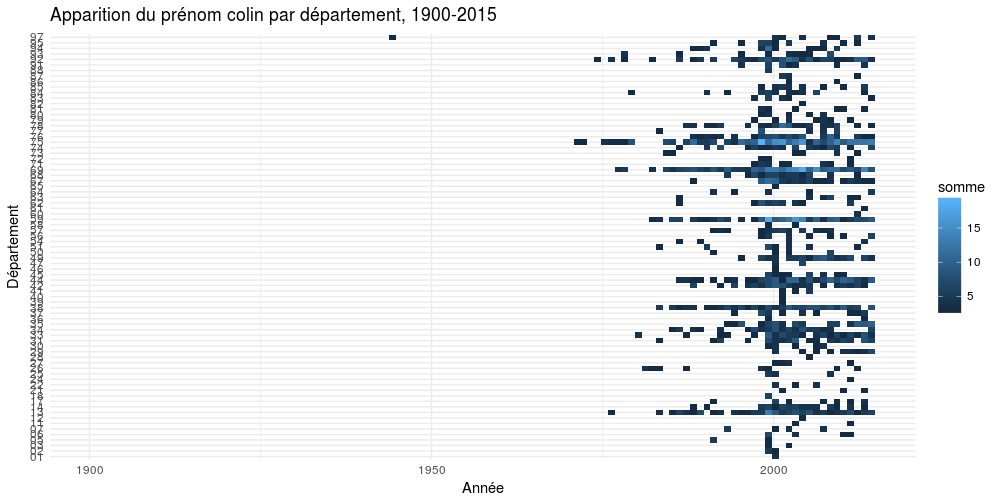
So yeah, it’s that simple. Let’s try with another name.
(And of course, you can specify a different color scale for your plot)
choix <- "ELISABETH"
name %>%
  filter(prenom == choix) %>%
  group_by(annee, dpt) %>%
  summarise(somme = sum(nombre)) %>%
  na.omit() %>%
  ggplot(aes(annee, dpt, fill = somme)) +
  geom_tile() +
  scale_x_date(limits =  c(lubridate::ymd("1900-01-01"), lubridate::ymd("2015-01-01"))) +
  #Changer l'échelle de couleurs
  scale_fill_gradient(low = "#E18C8C", high = "#973232") +
  xlab("Année") +
  ylab("Département") +
  labs(title = paste0("Apparition du prénom ", tolower(choix)," par département, 1900-2015")) +
  theme_minimal()
Pretty easy isn’t it?
What do you think?